This project began as a standard practice task: redesign the core screens of a document scanning application to improve its usability and visual appeal.
The ApproachI hypothesized that scanning documents is often a stressful, bureaucratic chore that can trigger anxiety. Therefore, I based my design decisions on Trauma-Informed Design principles, aiming to reduce cognitive load and create a sense of safety for users in high-stress situations.
To ground the design in established research, I adapted the Trauma-Informed Care principles outlined by SAMHSA (Substance Abuse and Mental Health Services Administration).
Safety (Physical & Emotional)The interface must not feel "threatening." This means avoiding aggressive colors (alert reds), sudden movements (pop-ups), or ambiguous states that might trigger a "Fight or Freeze" response.
Trustworthiness & Transparency
Operations must be transparent. The user needs to know exactly what the system is doing at any given moment to maintain a sense of control and predictability.
Analyzing the flaws of the original interface based on Nielsen's Heuristics.
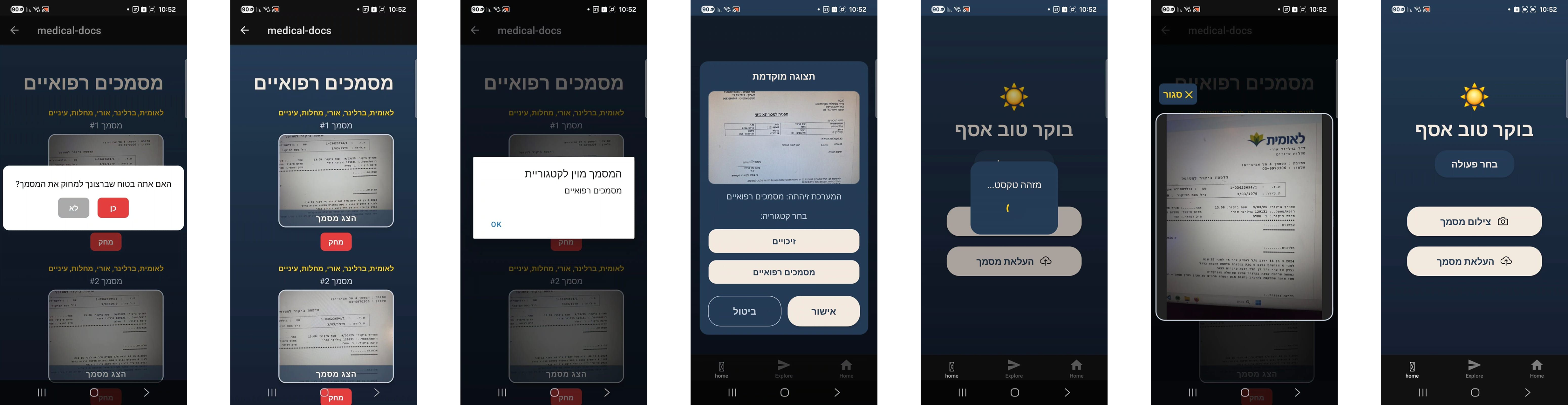
Shifting from "Error Recovery" to "Error Prevention".
Invisible Tech
Instead of asking the user to manually sort and fix documents, the system handles the complexity in the background (Auto-Alignment, Lighting Correction), requiring zero configuration from the user.
Calm UI Patterns
Utilizing "Safety Cues" based on Polyvagal Theory. The interface uses soft transitions and reassuring micro-copy to keep the user in a regulated state.
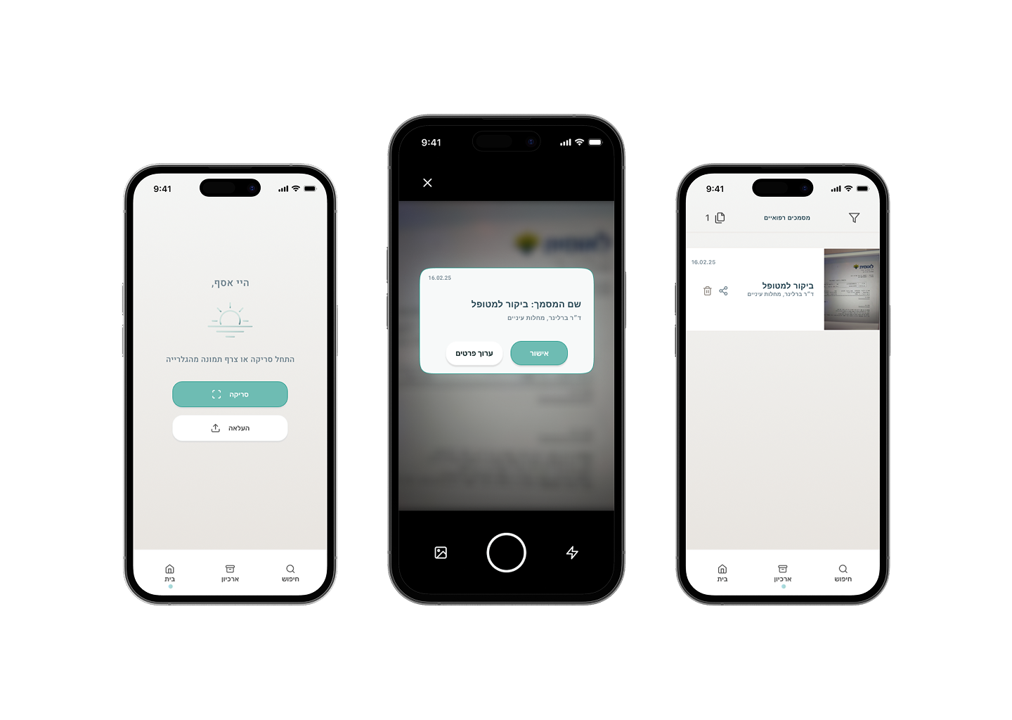
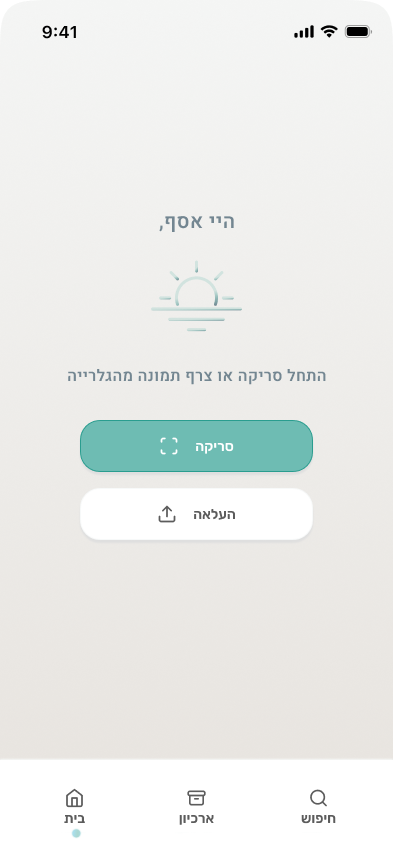
The "Sunrise" Zero-UIA clutter-free entry point. Instead of a dashboard full of red alerts, the user meets a calm, single-action screen. The primary action is prioritized using color psychology to reduce decision time (Hick's Law).
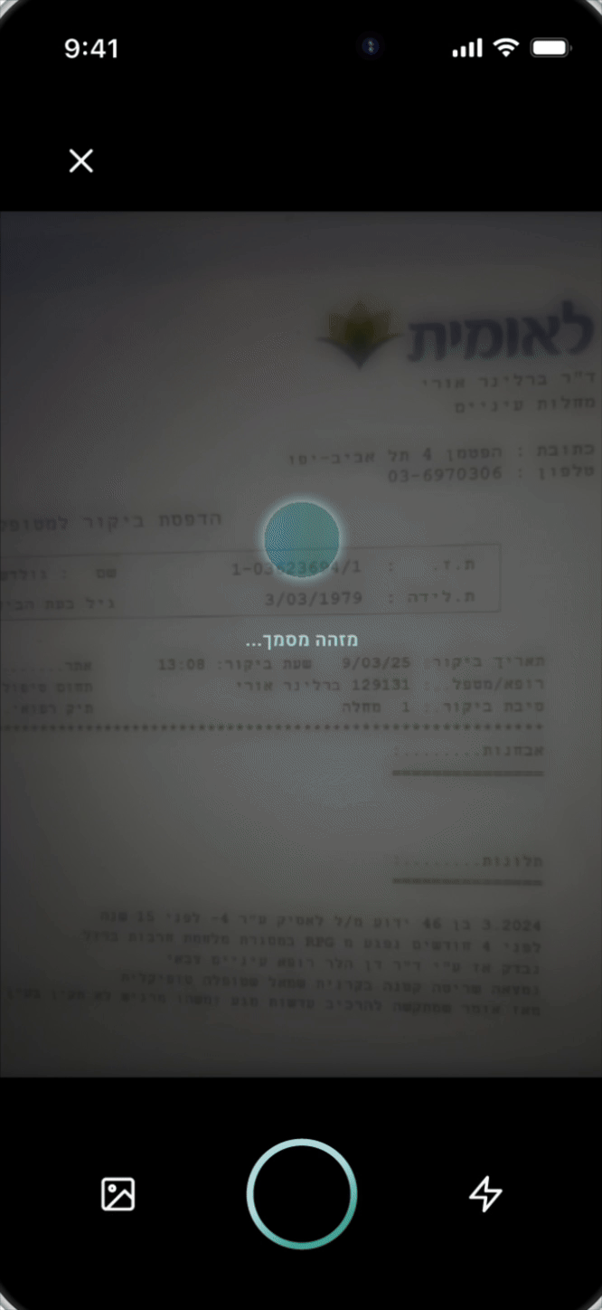
"Darkroom" Focus ModeTo combat Cognative Tunneling, the scanning interface dims the environment. This minimizes visual noise and creates a sense of privacy and focus, allowing the user to concentrate solely on the physical document.
The "Breathing" Feedback LoopReplacing stress-inducing spinners with a "Breathing Circle." The system utilizes transparent status updates ("Aligning...", "Enhancing...") to reassure the user that the technology is working for them.