Words Matter

Designing an interface for nuance, context, and shared understanding.

Photo of the main page of the system View Prototype

About The Project

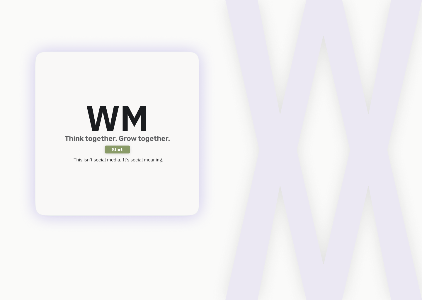
WM (Words Matter) is a concept platform that redefines how users collect and share information online. Drawing from cognitive psychology - short-term vs. long-term memory - it separates fast reactions from meaningful insights. The experience encourages reliability, source-checking, and critical thinking, while shaping more human, respectful interactions, between users and the interface.

The Problem

Most social platforms amplify noise and popularity over truth. Users feel overwhelmed, unsure what to trust, and exposed to misleading content. This highlighted the need for an anti-hierarchical system that reduces information pollution and creates a calm, safe space for discovering quality content - without chasing likes or status.

Computer monitor displaying a line graph with four connected data points over a segmented horizontal axis.

User Research

I examined how people interpret information online and what helps them feel informed, confident, and understood.

Key Insights

  • People struggled to trust content without context  
  • Many wanted slower, calmer conversations
  • Users were exhausted from algorithmic feeds

Competitive Landscape

LinkedIn logoV1 logo in white and orange on black background.x logo (twitter)
LinkedIn logo

What they do

  • Professional network for sharing updates, articles, and work-related content

Where it works well

  • Identity-based profiles create accountability.
  • Showcasing achievements and finding opportunities.

Limitations

  • Performative culture: Content is often overly curated to impress recruiters.
  • Discussions tend to be safe and promotional rather than deep.
v1 logo

What they do

  • Delivers curated news coverage from established editorial sources.
  • Focuses on broadcasting real-time updates to a passive audience.

Where it works well

  • High authority and verified professional journalism.
  • Clear separation between facts and opinions.

Limitations

  • Editorial Gatekeeping: Users can submit tips or footage, but editors have final control.
  • No internal platform for discussion between users.
x (twitter) logo

What they do

  • Real-time platform for micro-blogging and joining public conversations.

Where it works well

  • Unmatched speed of information distribution.
  • Direct access to public figures and global discourse.

Limitations

  • Algorithmic bias: Prioritizes outrage and engagement over truth.
  • High noise-to-signal ratio makes focus nearly impossible.

Persona

Oded, 27

Construction Engineering Tech
Medium Content consumer
Primary Source: Telegram / Closed Groups
Low trust in sources
Core Need: Psychological Safety & Clarity

Pain Points

Cognitive Overload: Feels exhausted by the constant need to filter "fake news" and engagement-bait on public feeds.
Fear of Toxicity: Avoids commenting on mainstream platforms (X/Facebook) to escape hostile backlash.
The "Echo Chamber" Trap: Retreats to closed groups for safety, but worries he’s missing the full picture.

Goals

Context over Noise: To understand the source and validity of a story before emotionally reacting to it.
Safe Discourse: To find a space for nuanced discussion where opinions aren't immediately attacked.
“I don’t trust most sources.”

Wireframes

Early sketches featured an algorithmic 'Trust Meter'. Research showed users distrust system ratings, so the design pivoted to Source Transparency—empowering users to investigate context rather than relying on a score.

Wireframe with two rectangles labeled 'LOGO & Summary' at the top and 'SIGN IN' below on a light gray background.
Wireframe layout of a webpage with a left sidebar navigation, five horizontal content blocks each containing a smaller vertical block, and a right sidebar for news, agenda, and sources.
Wireframe layout with sidebar navigation on left, main content with Chinese text and video placeholder in center, and news/agenda sources on right.

The Design

WM uses a calm, neutral color palette to support a non-hierarchical, human-centered experience. The design avoids loud or competitive tones, aiming for clarity and trust.

Rubik
Aa
IBM
Aa

Key Features

Dual-Memory Architecture

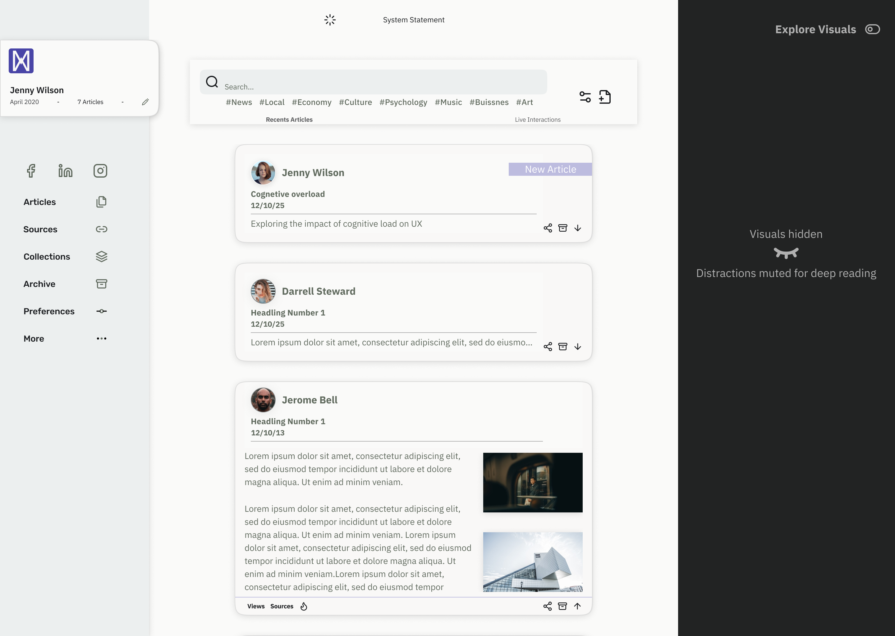
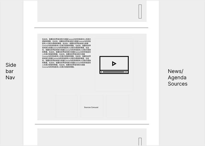
A clear distinction between noise and signal. Short-term updates automatically expire after 24 hours to prevent backlog, keeping the main feed reserved exclusively for high-value, permanent content.

User interface gif
User interface gif

Context-Based Ranking

To filter out noise, the publishing flow rewards effort. The more context and attribution a user provides during drafting, the higher their post ranks in the global feed - creating a quality-first ecosystem.

Quiet Mode

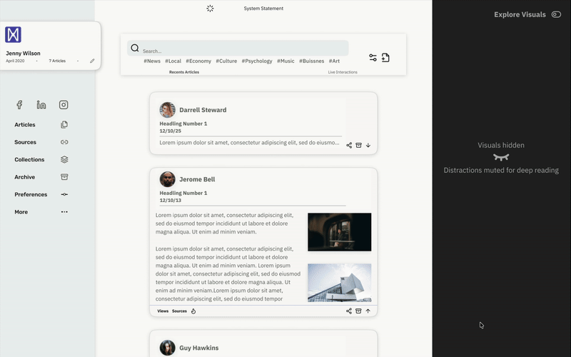
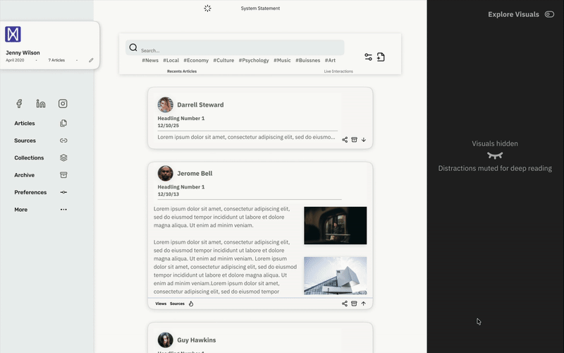
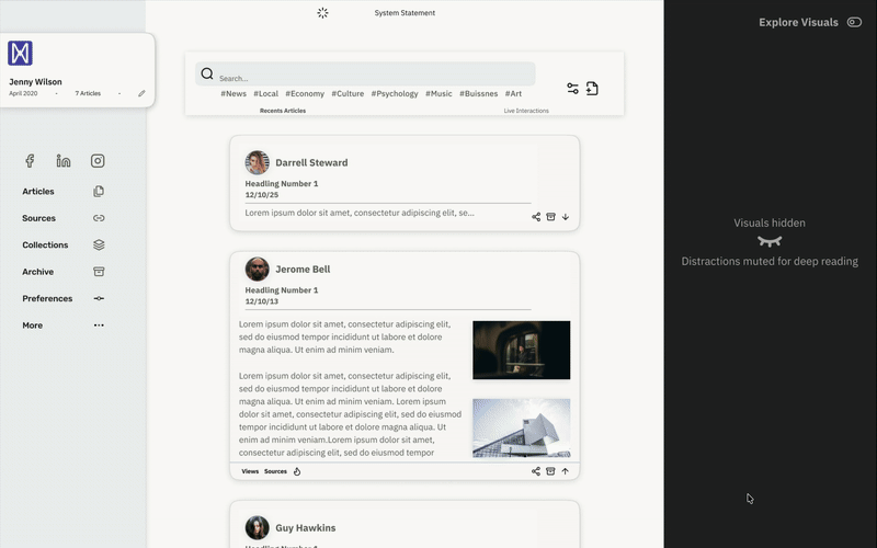
A user-controlled toggle that hides visual distractions, allowing for a "Deep Work" reading experience.

User interface gif

The Solution

WM introduces a more intentional way to navigate information online - one that values understanding over competition. The system balances the need to verify and structure digital knowledge with the need to preserve warm, human interactions between users. It demonstrates how UX design can cut through noise, support meaningful contribution, and guide people toward content that’s genuinely useful.

sign in screenshot